 Design
Driving Southeast Asia Forward Through People-Focused Design
Southeast Asia is home to around 650 million people from diverse and comparatively different economic, political and social backgrounds. Many people in the region today rely on superapps like Grab to earn a daily living or get from A to B more efficiently and safely. This means that decisions made have real impact on people’s lives – so how do you know when your decisions are right or wrong?
In this post, I’ll share key consumer insights that have guided my decisions and informed my design thinking over the last year whilst working as a product designer for Grab in Singapore. I’ve broken my learnings down into 3 transient areas for thinking about product development and how each one addressed our consumers’ needs.
- Relevance – does the design solve the consumer problem? For example, loss of connectivity which is common in Southeast Asia should not completely prevent a consumer from accessing the content on our app.
- Inclusivity – does the design consider the full range of consumer diversity? For example, a driver waiting in the hot sun for his passenger can still use the product. Inclusive design covers people with a range of perspectives, disabilities and environments.
- Engagement – does the design invoke a feeling of satisfaction? For example, building a compelling narrative around your product that solicits a higher engagement.
Under each of these areas, I’ll elaborate on how we’ve built empathy from consumer insights and applied these to our design thinking.
But before jumping in, think about the lens which frames any consumer experience – the mobile device. In Southeast Asia, the commonly used devices are inexpensive low-end devices made by OPPO, Xiaomi, and Samsung. Knowing which devices consumers use helps us understand potential performance constraints, different screen resolutions, and custom Android UIs.
Designing for Relevance
Connectivity
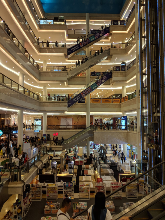
In Southeast Asia, it’s not too hard to find public WiFi. However, the main challenge is finding a reliable network. Take this shopping mall in Medan, Indonesia. The WiFi connectivity didn’t live up to the modern infrastructure of the building. The locals knew this and used mobile data over spotty and congested connectivity. Mobile data is the norm for most people and 4G reach is high, but the power of the connections is relatively low.
Building Empathy
To genuinely design for consumers’ needs, designers at Grab regularly get out the office to understand what people are doing in the real world. But how do we integrate empathy and compassion into the design process? Throughout this article, I’ll explain how the insights we gathered from around Southeast Asia can inform your decision making process.
For simulating a loss of connectivity, switch to airplane mode to observe current UI states and limitations. If you have the resources, create a 2G network to compare how bandwidth constraints page loading speeds. Network Link Conditioner for Mac and iOS or Lighthouse by Chrome DevTools can replicate a slower network.
Design Implications
This diagram is from Scott Hurff’s book, Designing Products People Love. The book is amazing, but if you don’t have the time to read it, this article offers a quick overview.
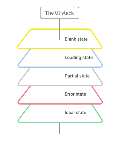
An ideal state (the fully loaded experience) is primarily what a lot of designers think about when problem-solving. However, when connectivity is a common consumer pain-point, designers at Grab have to design for the less desirable: Blank, Loading, Partial, and Error states in tandem with all the happy paths. Latency can make or break the user experience, so buffer wait times with visual progress to cushion each millisecond. Loading skeletons when you open Grab, act as momentary placeholders for content and reduce the perceived latency to load the full experience.
A loss of connectivity shouldn’t mean the end of your product’s experience. Prepare connectivity issues by keeping screens alive through intuitive visual cues, messaging, and cached content.
Device Type and Condition
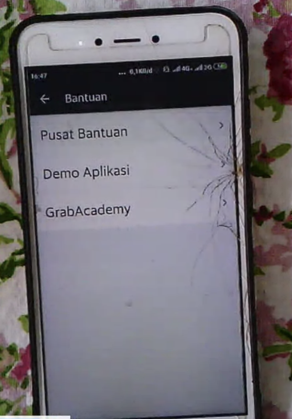
In Southeast Asia, people tend to opt for low-end or hand-me-down devices that can sometimes have cracked screens or depleting batteries. These devices are usually in circulation much longer than in developed markets, and the device’s OS might not be the latest version because of the perceived effort or risk to update.
Building Empathy
At Grab, we often use a range of popular, in-market devices to understand compatibility during the design process. Installing mainstream apps to a device with a small screen size, 512MB internal memory, low resolution and depleting battery life will provide insights into performance. If these apps have lite versions or Progressive Web Apps (PWA), try to understand the trade-offs in user experience compared to the parent app.
Design Implications
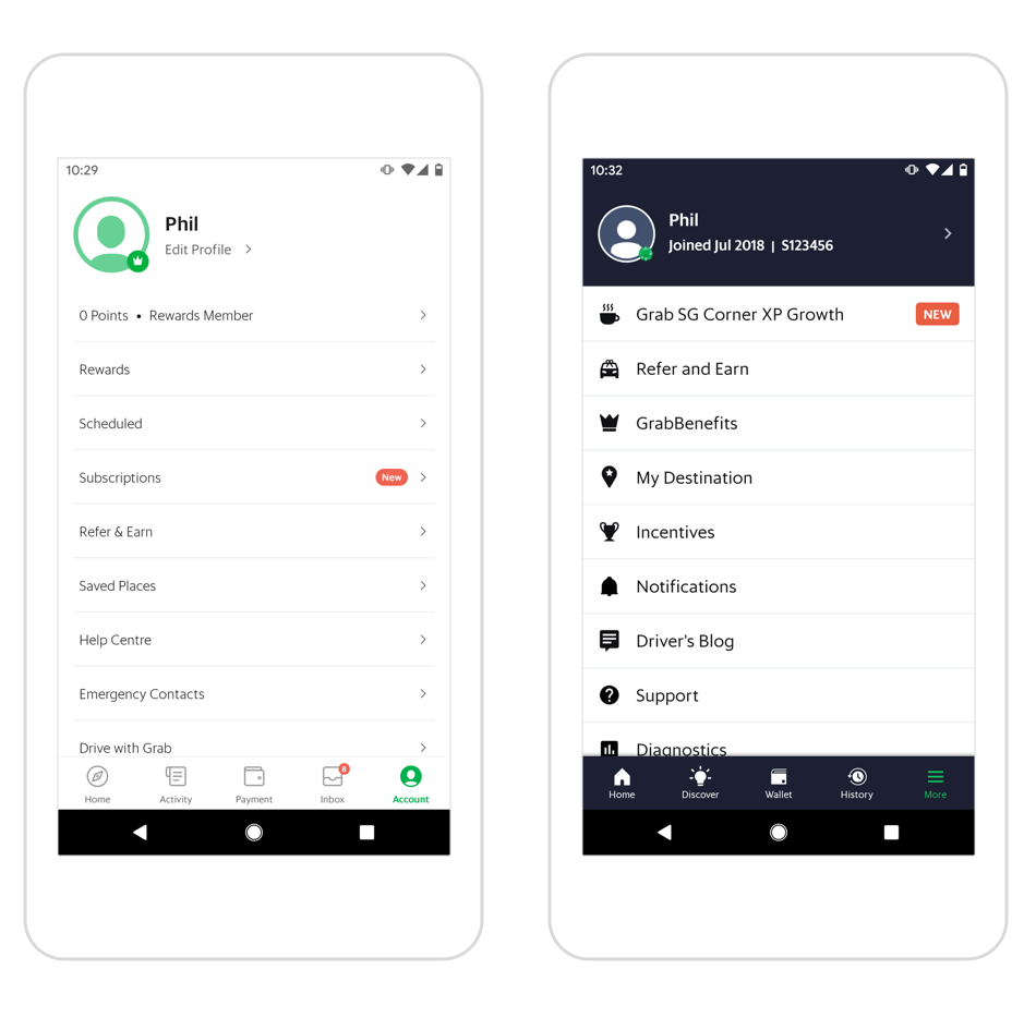
Design for small screens first to reduce the chances of design debt later in the development lifecycle. For interactive elements, it’s important to think about all types of consumers that will use the product and in what circumstances. For Grab’s driver-partners who may have their devices mounted to the dashboard, tap targets need to be larger and more explicit.
Similarly, colour contrast will vary depending on screen resolution and time of the day. Practical tests involve dimming the screen and standing near a window in bright sunshine (our HQ is in Singapore which helps!). To further improve accessibility, use a tool like Sketch’s Stark plugin to understand if contrast ratios are accessible to visually impaired consumers. A general rule is to aim for higher contrast between essential UI components, text and interactive affordances.
Fancy transitions can look great on high-end devices but can appear choppy or delayed on older and less performant phones. Aim for simple animations to offer a more seamless experience.
Day-to-day Budgeting
Many people in Southeast Asia earn a daily income, so it’s no surprise that prepaid mobile is more common over a monthly contract. This mindset to ration on a day-to-day basis also extends itself to other essentials like washing powder and nappies. Data can be an expensive necessity, and consumers are selective over the types of content that will consume a daily or weekly budget. Some consumers might turn off data after getting a ride, and not turn it back on until another Grab service is required.
Building Empathy
Rationing data consumption daily can be achieved through not connecting to WiFi, or a more granular way is to turn off WiFi and use an app like Google’s Datally on Android to cap data usage. Starting low, around 50MB per day will increase your understanding around the data trade-offs you make and highlight the apps that require more data to perform certain actions.
Design Implications
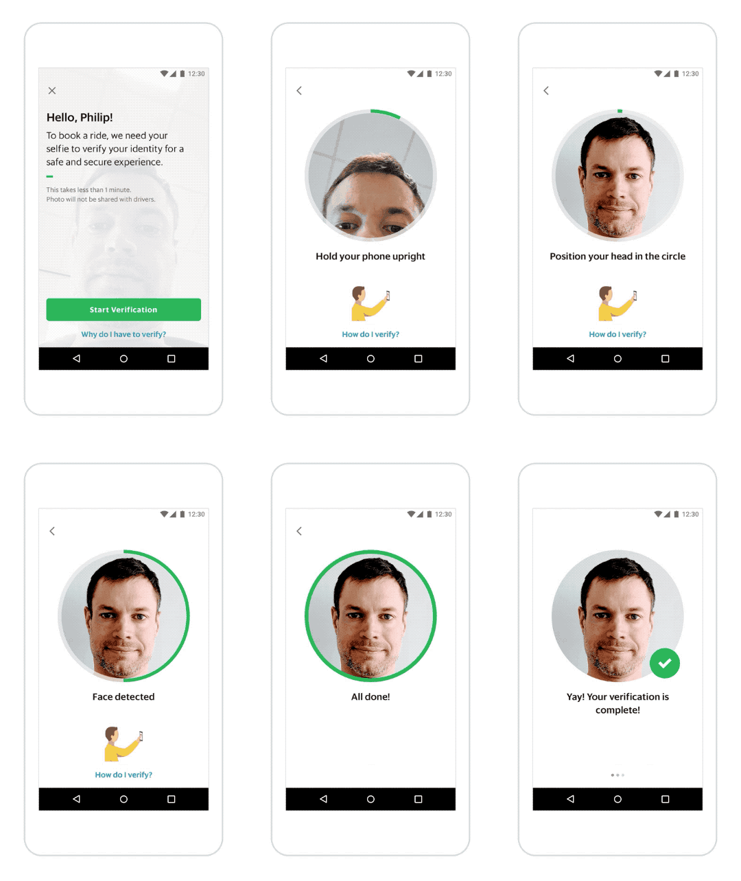
Where possible, avoid using video when SVG animations can be just as effective, scalable and lightweight. For Grab’s passenger verification flow, we decided to move away from a video tutorial and keep data consumption to a minimum through utilising SVG animations. When a video experience is required, like Grab’s feed on the home screen, disabling autoplay and clearly distinguishing the media as video allowed consumers to decide on committing data.
Design for Inclusivity
Mobile-only
The expression “mobile-first” has been bounced around for the last decade, but in Southeast Asia, “mobile-only” is probably more accurate. Most consumers have never owned a tablet or laptop, and mobile numbers are more synonymous with a method of registration over an email address. In the region, people rely more on social media and chat apps to understand broadcast or published news reports, events and recommendations. Consumers who sign up for a new Grab account, prefer phone numbers and OTP (one-time-password) registration over providing an email address and password. And anecdotally from interviews conducted at Grab, consumers didn’t feel the need for email when communication can take place via SMS, WhatsApp, or other messaging apps.
Building Empathy
At Grab, we apply design thinking from a mobile-only perspective for our passenger, merchant, and driver-partner experiences by understanding our consumers’ journeys online and off. These journeys are synthesised back in the office and sometimes recreated with video and physical artifacts to simulate the consumer experience. It’s always helpful to remove smartwatches, put away laptops and use an in-market device that offers a similar experience to your consumers.
Design Implications
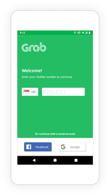
When onboarding new consumers, offer a relevant sign-in method for a mobile-only consumer, like phone number and social account registration. Grab’s passenger sign-up experience addresses these priorities with phone number first, social accounts second.
PC-era icons are also widely misunderstood by mobile-only consumers, so avoid floppy disks to imply Save, or a folder to Change Directory as these offer little symbolic meaning. When icons are paired with text, this can often reinforce meaning and quicken recognition. For example, a pencil icon alone can be confusing, so adding the word “Edit” will provide more clarity.

Diversity and Safety
This photo was taken in Yogyakarta, Indonesia. In the evening, women often formed groups to improve personal safety. In an online environment, women often face discrimination, harassment, blackmail, cyberstalking, and more. Minorities in emerging markets are further marginalised due to employment, literacy, and financial issues.
Building Empathy
Southeast Asia has a very diverse population, and it’s important to understand gender, ethnic, and class demographics before you plan any research. Research recruitment at Grab involves working with local vendors to recruit diverse groups of consumers for interviews and focus groups. When spending time with consumers, we try to understand how diversity and safety factors contribute to the experience of the product.
If you don’t have the time and resources to arrange face-to-face interviews, I’d recommend this article for creating a survey: Respectful Collection of Demographic Data
Design for Inclusivity
Allow people to control how they represent their identities through pseudonym names and avatars. But does this undermine trust on the platform? No, not really. Credit card registration or more recently, Grab’s passenger and driver selfie verification feature has closed the loop on suspect accounts whilst maintaining everyone’s privacy and safety.
On the visual design side, our illustration and content guide incorporates diverse representations of ethnic backgrounds, clothing, physical ability, and social class. You can see examples in the app or through our Dribbble page. For user-generated content, allow people to report and flag abusive material. While data and algorithms can do so much, facts and ethics cannot be policed by machine learning.
Language
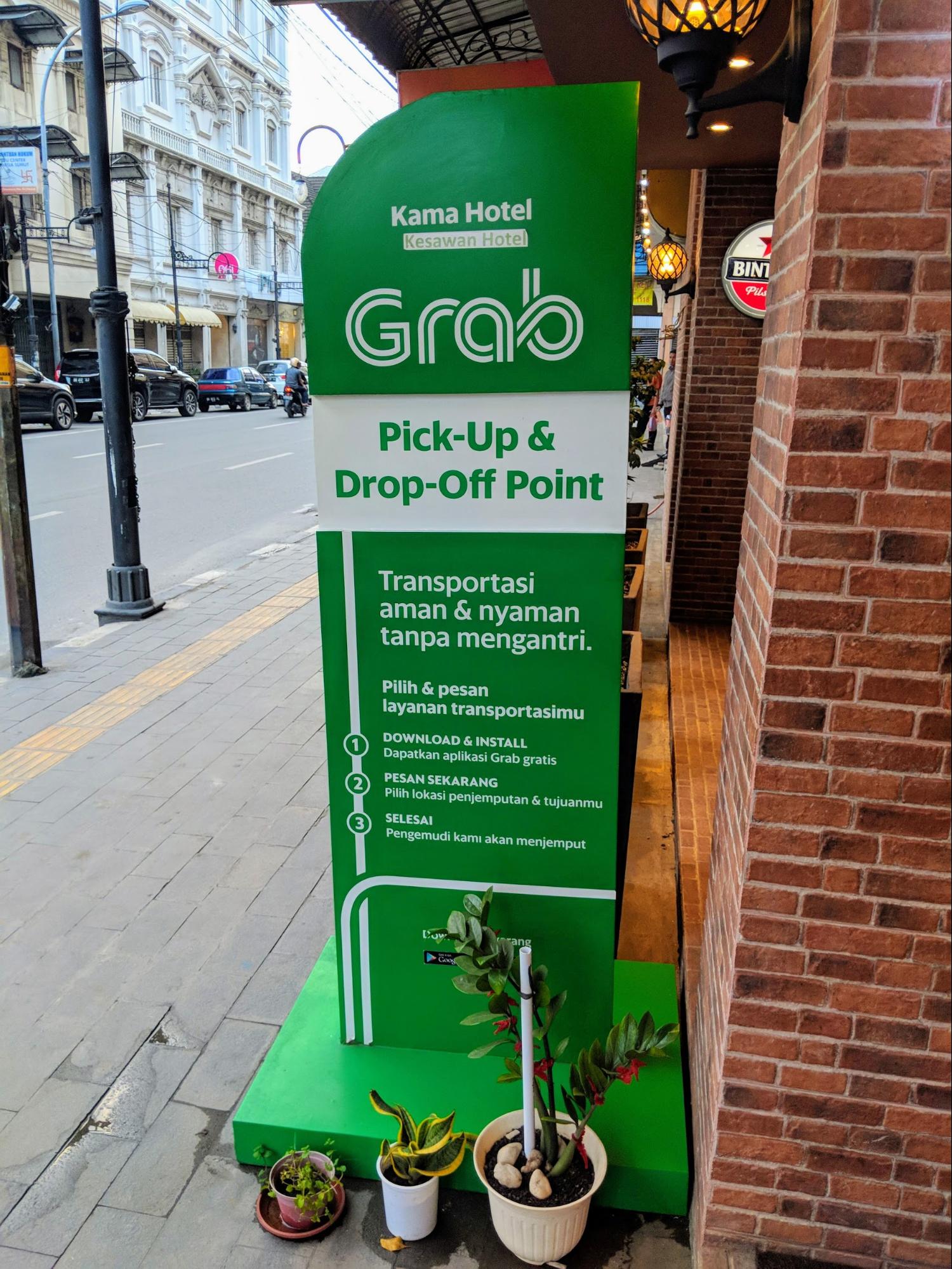
In Southeast Asia and other emerging markets, consumers may set their phone to a language which they aspire to learn but may not fully comprehend. Swipe, tap, drag, pinch, and other specific terms relating to interactions might not easily translate into the local language, and English might be the preferred language regardless of comprehension. It’s surprisingly common to attend an interview with a translator but the device’s UI is set to English.
Building Empathy
If your app supports multiple languages, try setting your phone to a different language but know how to change it back again! At Grab, we test design robustness by incorporating translated text strings into our mocks. Look for visual cues to infer meaning since some consumers might be illiterate or not fully comprehend English.
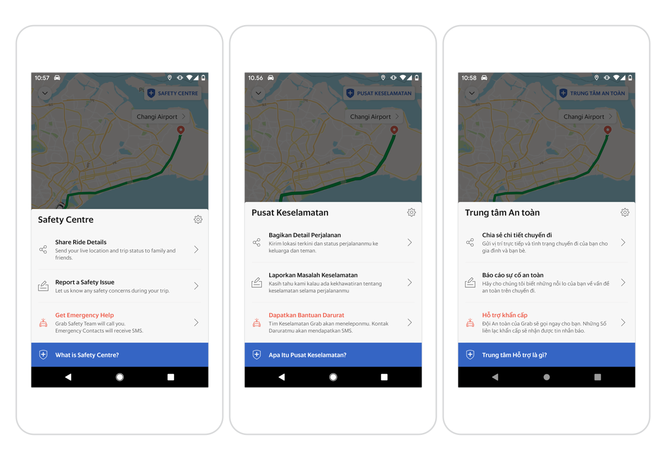
Design for Different Languages, Formats and Visual Cues
To reduce design debt later on, it’s a good idea to start with the smallest screen size and test the most vulnerable parts of the UI with translated text strings. Keep in mind, dates, times, addresses, and phone numbers may have different formats and require special attention. You can apply multiple visual cues to represent important UI states, such as a change in colour, shape and imagery.
Design for Engagement
Sharing
From our research studies, word-of-mouth communication and consuming viral content via Instagram or Facebook was more popular than trawling through search page results. The social aspect is extended to the physical environment where devices can sometimes be shared with more than one person, or in some cases, one mobile is used concurrently with more than one user at a time. In numerous interviews, consumers talk about not using biometric authentication so that family members can access their devices.
Building Empathy
To understand the layers of personalisation, privacy and security on a device, it’s worth loaning a device from your research team or just borrow a friend’s phone (if they let you!). How far do you get before you require biometric authentication or a PIN to proceed further? If you decide to wipe a personal device, what steps can you miss out from the setup, and how does that affect your experience post setup?
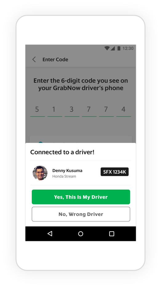
Design for Sharing
If necessary, facilitate device sharing through easy switching of accounts, and enable people to remove or hide private content after use. Allow content to be easily shared for both online and offline in-person situations. Using this approach, GrabNow allows passengers to find and connect with a nearby driver without having to pre-book and wait for a driver to arrive. This offline to online interaction also saves data and battery for the consumer.
Support and Tutoring
In Southeast Asia, people find troubleshooting issues from inside a help page troublesome and generally prefer human assistance, like speaking to someone through a call centre. The opportunity for face-to-face tutoring on how something works is often highly desired and is much more effective than standard onboarding flows that many apps use. From the many physical phone stores, it’s not uncommon for people to go and ask for help or get apps manually installed onto their device.
Building Empathy
Apart from speaking with your consumers regularly, always look through the Play and App Store reviews for common issues. Understand your consumers’ problems and the jargon they use to describe what happened. If you have a consumer support team, the tickets created will be a key indicator of where your consumers need the most support.
Help and Feedback Design Implications
Make support accessible through a variety of methods: online forms, email, and if possible, allow consumers to call in. With in-app or online forms, try to use drop-downs or pre-populated quick responses to reduce typing, triage the type of support, and decrease misunderstanding when a request comes in. When a consumer makes a Grab transport booking for the first time, we assist the consumer through step-by-step contextual call-outs.
Local Aesthetics
This photo was taken in Medan, Indonesia, on the day of an important wedding. It was impressive to see hundreds of handcrafted, colourful placards lining the streets for miles, but maybe more admirable that such an occasion was shared with the community and passers-by, and not only for the wedding guests.
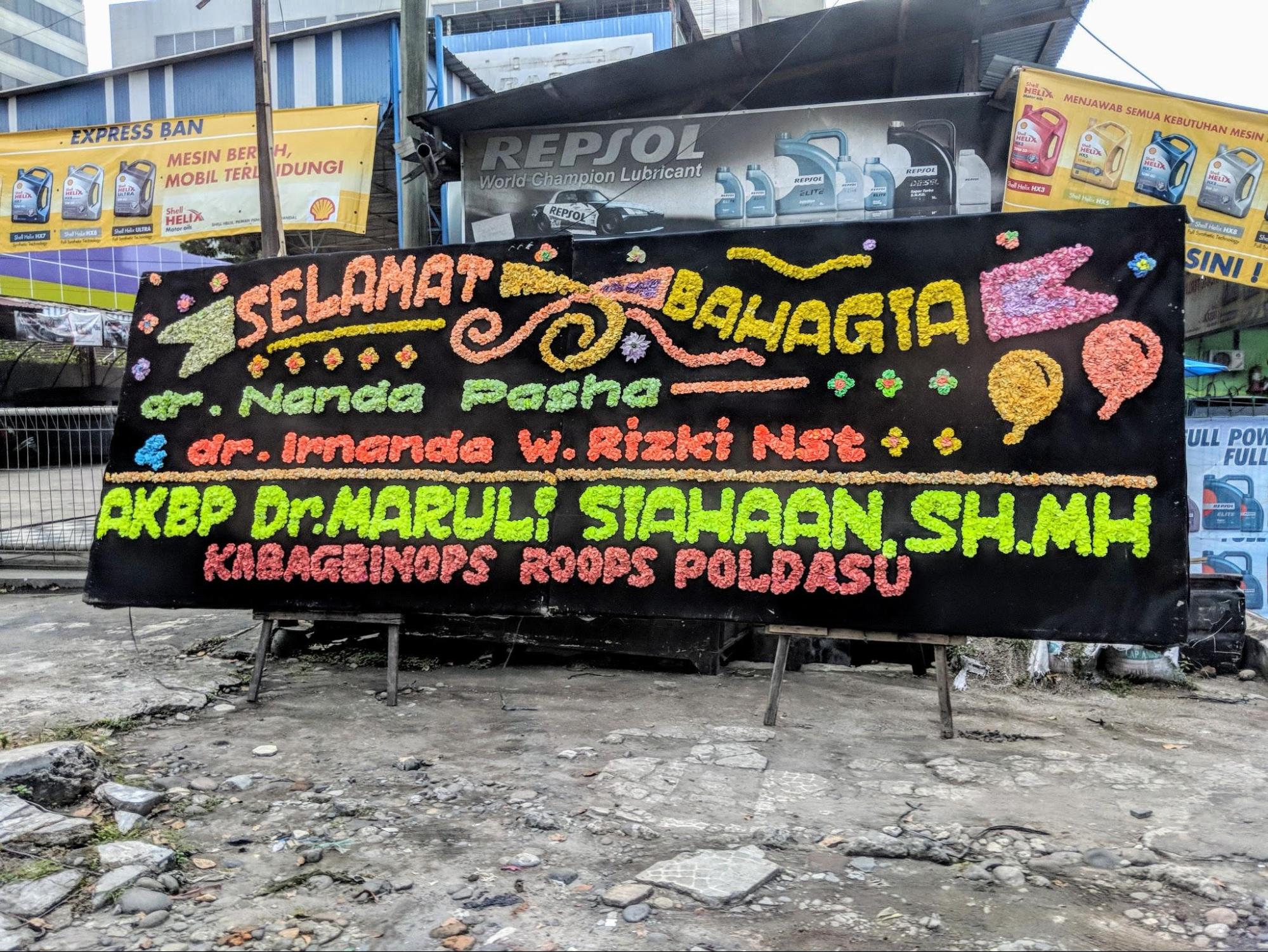
These types of public displays are not exclusive to weddings in Southeast Asia, vibrant colours and decorative patterns are woven into the fabric of everyday life, indicative of a jovial spirit that many people in the region possess.
Building Empathy
What are some of the immediate patterns and surfaces that exist in your workspace? Looking around your immediate environment can provide an immediate assessment of visual stimuli that can influence your decisions on a day-to-day basis.
Wall space can be incredibly valuable when you can display photos from your research trip, or find online inspiration to recreate some of the visual imagery from your target markets. When speaking with your consumers, ask to see mobile wallpapers, and think about how fashion could also play a role in determining an aesthetic choice. Lastly, take time out when on a research trip to explore the streets, museums, and absorb some of the local cultures.
Design to Delight and Surprise Consumers
Capture local inspiration on research trips to incorporate into visual collections that can be a source of inspiration for colour, imagery, and textures. Find opportunities in your product to delight and engage consumers through appropriate images and visuals. Grab’s marketing consent experience leverages illustrative visuals to help consumers understand the different categories that require their consent.
For all our markets, we work with local teams around culturally sensitive visuals and imagery to ensure our content is not offensive or portrays the wrong connotations.
My Top 5 for Guerrilla Field Research
If you don’t have enough time, stakeholder buy-in or budget to do research, getting out of the office to do your own is sometimes the only answer. Here are my top 5 things to keep in mind.
- Don’t jump in. Always start with observation to capture consumers’ natural behaviour.
- Sanity check scripts. Your time and consumers’ time is valuable; streamline your script and prepare for u-turns and potential Facebook and Instagram friend requests at the end!
- Ask the right people. It’s difficult to know who wants to or has time for your 10-minute intercept. Look for individuals sitting around and not groups if possible (group feedback can be influenced by the most vocal person).
- Focus on the user. Never multitask when speaking to the user. Jotting notes on an answer sheet is less distracting than using your mobile or laptop (and less dangerous in some places!). Ask permission to record audio if you want to avoid note-taking all together but this does create more work later on.
- Use insights to enrich understanding. Insights are not trends and should be used in conjunction with quantitative data to validate decision making.
Feel inspired by this article and want to learn more? Grab is hiring across Southeast Asia and Seattle. Connect with me on LinkedIn or Twitter @PhilipMadeley to learn more about design at Grab.
