
Recipe for Building a Widget: How We Helped to “Peak-Shift” Demand by Helping Passengers Understand Travel Trends
Stuck in traffic in a Grab ride? Pass the time by opening your Grab app and checking out the Feed - just scroll down! You’ll find widgets for games, polls, videos, news and even food recommendations!
Beyond serving your everyday needs, we want to provide our users with information that is interesting, useful and relevant. That’s why we’re always coming up with new widgets.
Building each widget takes close collaboration across multiple different teams - from Product Management to Design, Engineering, Behavioural Science, and Data Science and Analytics. Sounds like a lot of people, doesn’t it? But you’ll be surprised to hear that this behind-the-scenes collaboration works rapidly, usually in the span of one month! Which means we’re often moving from ideation phase to product release in just a few weeks.
This fast-and-furious process is anchored on one word - “consumer-centric”. And that’s how it all began with our “Travel Trends Widget” - a widget that provides passengers with an overview of historical supply and demand trends for their current location and nearby time periods.
Because we had so much fun developing this widget, we wanted to write a blog post to share with you what we did and how we did it!
Inspiration: Where it All Started
Transport demand can be rather lumpy. Owing to organic patterns (e.g. office hours), a lot of passengers tend to request for cars around the same time. In periods like this, the increase in demand could outpace the arrival of driver supply, increasing the waiting time for passengers.
Our goal at Grab is to make sure people get a ride when they want it and at the price they want, so we got to thinking about how we can ease this friction by leveraging our treasure trove - Big Data! - to help our passengers better plan their trips.
As we were looking at the data, we noticed that there is a seasonality to demand and supply: at certain times and days, imbalances appear, peak and disappear, and the process repeats itself. Studies say that humans in general, unless shown a compelling reason or benefit for change, are habitual beings subject to inertia. So we set out to achieve exactly that: To create a widget to surface information to our passengers that may help them alter their decisions on when they choose to book a ride, thereby redistributing some of the present peak demands to periods just before and after peak - also known as “peak shifting the demand”!
While this widget is the first-of-its-kind in the ride-hailing industry, “peak-shifting” was actually coined and introduced long ago!
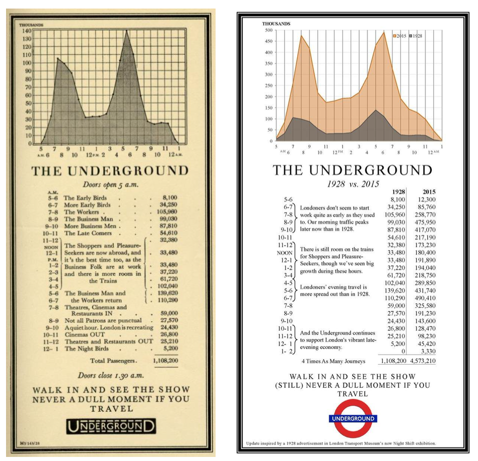
As you can see from this post from the London Transport Museum (Source: Transport for London), London tube tried peak-shifting long before anyone else: Original Ad from 1928 displayed on the left, and Ad from 2015 displayed on the right, comparing the trends to 1928.
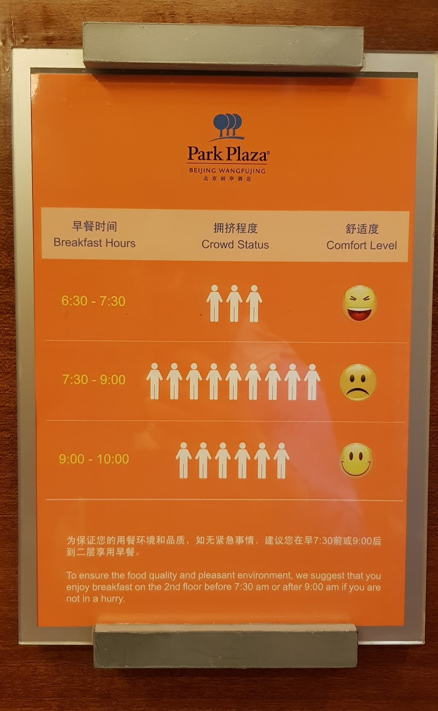
You may also have seen something similar at the last hotel you stayed at. Notice here a poster in an elevator at a Beijing hotel, announcing the best times to eat breakfast in comfort and avoid the crowd. (Photo credits to Prashant, our Product Manager, who saw this on holiday.)
How the Travel Trends Widget Works
To apply “peak-shifting” and help our users better plan their trips, we decided to dig in and leverage our data. It was way more complex than we had initially thought, as market conditions could be different on different days. This meant that generic statements like “5PM-8PM are peak hours and prices will be hight” would not hold true. Contrary to general perception, we observed that even during peak hours, there are buckets of time when there is no surge or low surge.
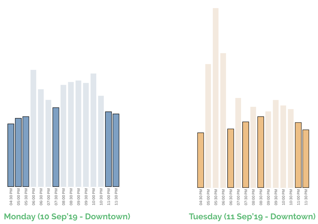
For instance, plot 1 and plot 2 below shows how a typical Monday and Tuesday surge looks like in a given month respectively. One of the key insights is that the surge trends during peak hour is different on Monday from Tuesday. It reinforces our initial hypothesis that every day is unique.
So we used machine learning techniques to build a forecasting widget which can help our users and give them the power to plan their trips beforehand. This widget is able to provide the pricing trends for the next 2 hours. So with a bit of flexibility, riders can ride the tide!
So How Exactly does This Widget Work?!
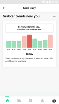
It pulls together historically observed imbalances between supply and demand, for the consumer’s current location and nearby time periods. Aggregated data is displayed to consumers in easily interpreted visualisations, so that they can plan to leave at times when there are more supply, and with potentially more savings for fares.
How did We Build the Widget? Loop, Agile Working Process, POC & Workstream
Widget-building is an agile, collaborative, and simultaneous process. First, we started the process with analysis from Product Analytics team, pulling out data on traffic trends, surge patterns, and behavioural insights of both passengers and drivers in Singapore.
When we noticed the existence of seasonality for each day of the week, we came up with more precise analytical and business questions to dig deeper into the data. Upon verification of hypotheses, we decided that we will build a widget.
Then joined the Behavioural Science, UX (User Experience) Design and the Product Management teams, who started giving shape to the problem we are solving. Our Behavioural Scientists shared their expertise on how information, suggestions and choices should be presented to enable easy assimilation and beneficial action. Daily whiteboarding breakouts, endless back-and forth conversations, and a healthy amount of challenge-and-accept culture ensured that we distilled the idea down to its core. We then presented the relevant information with just the right level of detail, and with the right amount of messaging, to allow users to take the intended action i.e. shift his/her demand outside of peak periods if possible.
Our amazing regional Copywriting team then swung in to put our intent into words in 7 different languages for our users across South-East Asia. Simultaneously, our UX designers and Full-stack Engineers started exploring the best visual components to communicate data on time trends to users. More on this later, but suffice to say that plenty of ideas were explored and discarded in a collaborative process, which aimed to create something that’s intuitive and engaging while being robust and scalable to work across all types of devices.
While these designs made their way up to engineering, the Data Science team worked on finding the most rigorous method to deduce the historical trend of surge across all our cities and areas, and time periods within them. There were discussions on how to best store and update this data reliably so that the widget itself can access it with great performance.
Soon after, we went into the development process, and voila! We had the first iteration of the widget ready on our staging (internal testing) servers in just 2 weeks! This prototype was opened up to the core team for influx of feedback.
And just two weeks later, the widget made its way to our Singapore and Jakarta Feeds, accessible to the world at large! Feedback from our users started pouring in almost immediately (thanks to the rich feedback functionality that comes with each widget), ranging from great to sometimes not-so-great, and we listened to all of it with a keen ear! And thus began a new cycle of iterations and continuous improvement, more of which we will share in a subsequent post.
In the Trenches with the Creators: How Multiple Teams Got Together to Make this Come True
Various disciplines within our cross functional team came together to whip out this widget by quipping their expertise to the end product.
Using Behavioural Science to Simplify Choices and Design Good Outcomes
Behavioural Science helped to explore many facets of consumer behaviour in order to plan and design the widget: understanding how consumers think and conceptualising a widget that can be easily understood and used by the consumers.
While fares are governed entirely by market conditions, it’s important for us to explain the economics to consumers. As a consumer-centric company, we aim to make the consumers feel like they own their decisions, which they can take based on full information. And this is the role of Behavioural Scientists at Grab!
In guiding the consumers through the information, Behavioural Science team had the following three objectives in mind while building this Travel Trends widget:
- Offer transparency on the fares: By exposing our historic surge levels for a 4 hour period, we wanted to ensure that the passenger is aware of the surge levels and does not treat the fare as a nasty shock.
- Give information that helps them plan: By showing them surge levels for the future 2 hours, we wanted to help consumers who have the flexibility, plan for a better time, hence, giving them the power to decide based on transparent information.
- Provide helpful tips: Every bar gives users tips on the conditions at that time and the immediate future. For instance, a low surge bar, followed by a high surge bar gives the tip “Psst… Leave now, It might get busy later!”, helping people understand the graph better and nudging them to take an action. If you are interested in saving fares, may we suggest tapping around all the bars to reveal the secret pro-tips?
Designing Interfaces that Lead to Consumer Success by Abstracting Complexity
Design team is the one behind the colours and shapes that make up the widget that you see and interact with! The team took inspiration from Google’s Popular Times.
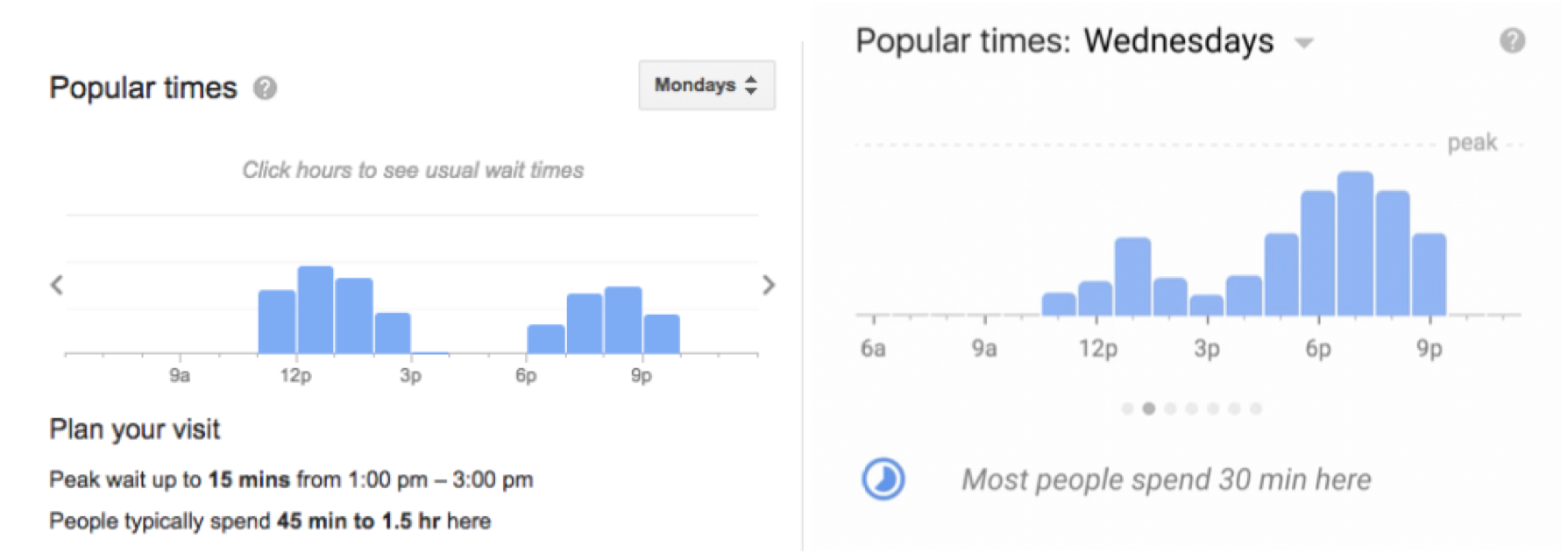 Source/Credits: Google Live Popular Times
Right from the offset, our content and product teams were keen to surface additional information and actions with each bar to keep the widget interactive and useful. One of the early challenges was to arrive at the right gesture that invites the user to interact and intuitively navigate the bars on the widget but also does not conflict with other gestures (eg scrolling and scrubbing) that the user was pre-trained to perform on the feed. We found out that tapping was simultaneously an unused and yet intuitive gesture that we could use for interaction with the bars.
We then went into rounds of iteration on the visual design of the widget. In this process, multiple stakeholders were involved ranging from Product to Content to Engineering. We had to overcome a number of constraints i.e. the limited canvas of a widget and the context of a user when she is exploring the feed. By re-using existing libraries and components, we managed to keep the development light and ship something fast.
Dozens of revisions and four iterations later, we landed with a design that we felt equipped the feature for its user-facing goal, and did so in a manner which was aesthetically appealing!
And finally we managed to deliver on the feature’s goal, by surfacing just the right detail of information in a manner that is intuitive yet effective to peak-shift demand.
Bringing All of This to Fruition Through High Performance Engineering
Our Development Engineering team was in charge of developing the widget and making it available to our users in just a few weeks’ time - materialising the work of the other teams.
One of their challenges was to find the best way to process the vast amount of data (millions of database entries) so it can be visualised simply as bar charts. Grab’s engineers had to achieve this while making sure performance is as resilient as possible.
There were two options in doing this:
a) Fetch the data directly from the DB for each API call; or
b) Store the data in an in-memory data structure on a timely basis, so when a user calls the API will no longer have to hit the DB.
After considering that this feature will likely expect a lot of traffic thus high QPS, we decided that the former option would be too costly. Ultimately, we chose the latter option since it is more performant and more scalable.
At the frontend, the challenge was to cater to the intricate request from our designers. We use chart libraries to increase our development speed, and not all of the requirements were readily supported by these libraries.
For instance, let’s say this library makes visualising charts easy, but not so much for customising them. If designers wanted to have an average line in a dotted form, the library did not support this so easily. Also, the moving arrow pointers as you move between bar chart, changing colours of the bars changes when clicked – all required countless CSS tweaks.
Closing the Product Loop with User Feedback and Data Driven Insights
One of the most crucial parts of launching any product is to ensure that consumers are engaging with the widget and finding it useful.
To understand what consumers think about the widget, whether they find it useful and whether it is helping them to plan better, we delved into the huge mine of clickstream data.
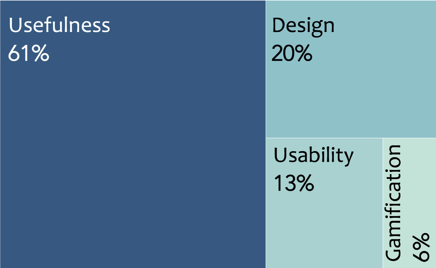
We found that 1 in 3 users who make a booking every day interact with the widget. And of these people, more than 70% users have given positive rating for the widget. This validates our initial hypothesis that if given an option, our consumers will love the freedom to plan their trips and inculcate more transparent ecosystem.
These users also indicate the things they like most about the widget. 61% of users gave positive rating for usefulness, 20% were impressed by the design (Kudos to our fantastic designer Ajmal!!) and 13% for usability.
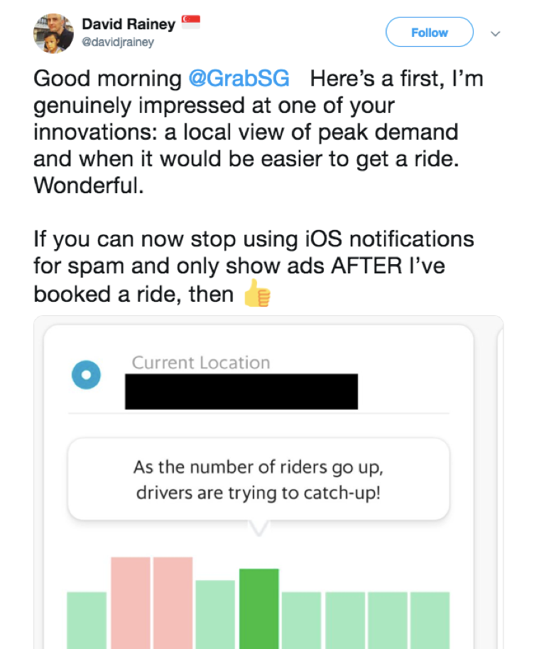
Beyond internal data, our widget made some rounds on social media channels. For Example, here is screenshot of what our users have to say on Twitter.
We closely track these metrics on user engagement and feedback to ensure that we keep improving and coming up with new iterations which helps us to serve our consumers in a better way.
Conclusion
We hope you enjoyed reading about how we went from ideation, through iterations to a finished widget in the hands of the user, all in 1 month! Many hands helped along the way. If you are interested in joining this hyper-proactive problem-solving team, please check out Grab’s career site!
And if you have feedback for us, we are here to listen! While we cannot be happier to see some positive reaction from the public, we are also thrilled to hear your suggestions and advice. Please leave us a memo using the Widget’s comment function!
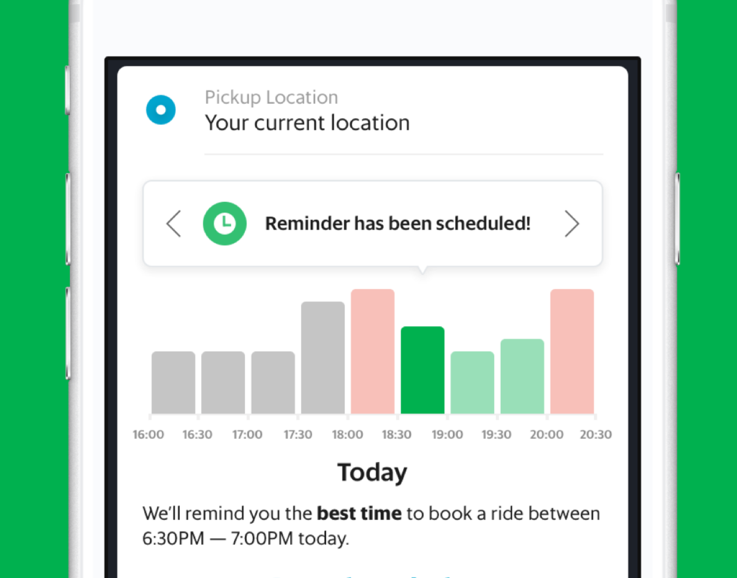
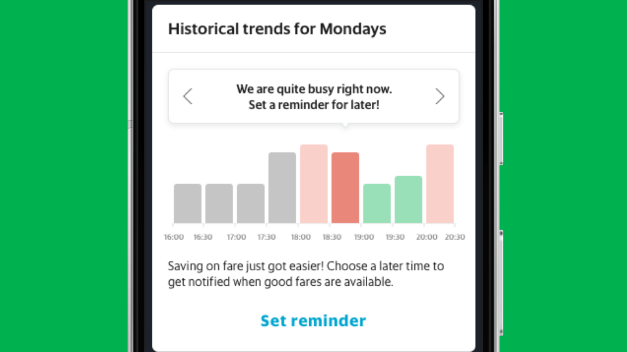
Epilogue
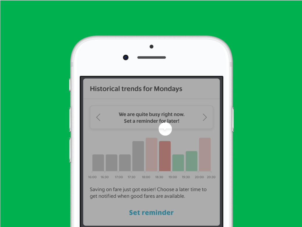
We just released an upgrade to this widget which allows users to set reminders and be notified about availability of good fares in a time period of their choosing. We will keep a watch and come knocking! Go ahead, find the widget on your Grab feed, set a reminder and save on fares on your next ride!